Chapter 2: Types of Stock Price Charts
As we learned, technical analysis is like predicting the future by looking at the past. It assumes that prices follow trends, history repeats itself, and the market tells all. In this chapter, we’ll explore the exciting world of different types of stock price charts, such as line charts, bar charts, and candlestick charts. We’ll also understand the different types of prices: open (O), high (H), low (L), and close (C).
You may wonder why we need charts in the first place. Charts help us clearly see price movements over time, making it easier to spot trends, patterns, and trading opportunities. Since technical analysis requires four data points to be displayed simultaneously for a complete view of price movements, charts also provide a clear picture of the market’s behavior, helping traders make informed decisions.
This chapter will focus on the different types of charts, especially Japanese candlestick patterns, which are one of the most loved chart types. But before that, we’ll look at the pros and cons of other charts to understand why candlesticks are so popular.
Trade Summary
Before we discuss the formation of different types of charts, let’s consider the different types of prices a stock trades at during a regular market day.
The Indian stock market is open from 9:15 AM to 3:30 PM. During these market hours, numerous trades occur throughout the day. Tracking all of these price movements is impossible for a trader. One needs a summary of the trading action that points to the important stuff, not the details on every price point.
Let’s understand what the open, high, low, and close prices are using a real-life example of Reliance Industries’ stock price:
- Open Price: The price at which Reliance Industries’ stock trades first when the market opens at 9:15 AM. For example, on June 7th 2024, the opening price was ₹2,857.
- High Price: The highest price at which Reliance Industries’ stock is traded during the day, between 9:15 AM and 3:30 PM. On June 7th 2024, the high price was ₹2,944.
- Low Price: The lowest price at which Reliance Industries’ stock is traded during the day, between 9:15 AM and 3:30 PM. On June 10th 2024, the low price was ₹2,853.
- Close Price: The price at which Reliance Industries’ stock is traded when the market closes at 3:30 PM. On June 10th 2024, the closing price was ₹2,940.
The trading session is considered ‘positive’ if the closing price is higher than the opening price, like in this case (₹2,940 close vs. ₹2,857 open). It is considered ‘negative’ if the closing price is lower than the opening price.
We use these prices to plot charts, which help us analyze future price movements. But let’s first understand why are charts so useful in the first place.
Why Traders Love Charts?
The chart is a price sequence plotted over a specific time frame, typically with a price scale on the y-axis and a time scale on the x-axis. Charts mainly help see past price movements, which in turn help us predict future price movements. Technical analysts use charts to analyze various securities and forecast future price movements. Charts also help fundamental analysts because they show how a company’s stock price reacts to its financial health.
Security
In finance, security is a claim that you can buy, sell, or trade, like a stock or bond. Stocks represent owning a part of a company, while a bond is a certificate of lending to the company with a promise of repayment with interest. Securities represent financial interest and let you earn from either ownership or lending.
Let’s explore the different types of charts and learn how they can be used.
Line Chart
The most basic chart type is a line chart because it uses only the closing price of the stock price or index over a defined period to form the chart. On the chart, a dot is plotted on a specified period, that is, the closing price, and then these dots are connected, forming a line that is plotted across a specific period of time.
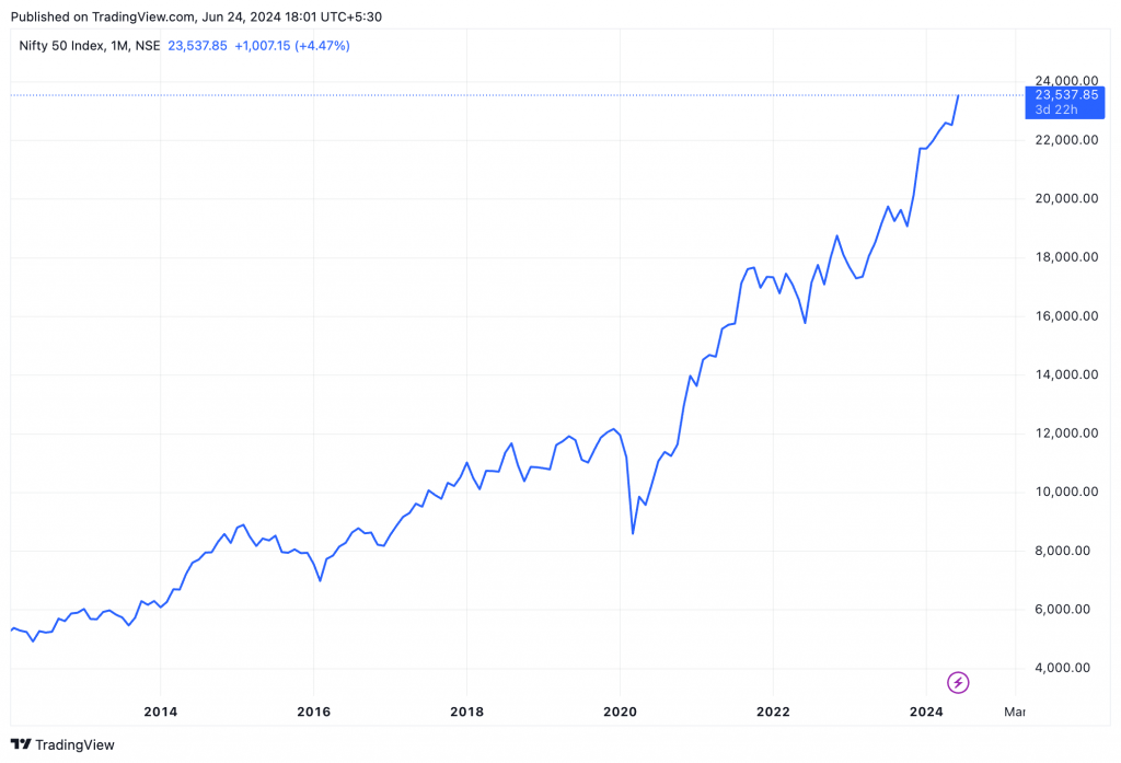
The advantage of a line chart is that it is simple and easy to understand, and a trader can identify general security trends over long periods of time like weeks, months, or years. The disadvantage is that they do not provide additional details besides closing prices, ignoring the open, high, and low prices. Though closing prices are useful,traders prefer seeing more information, taking us to the next type of chart.
Bar Chart
A bar chart is more flexible than a line chart because it considers all price types: open, high, low, and close. A bar chart looks like this and has three components:
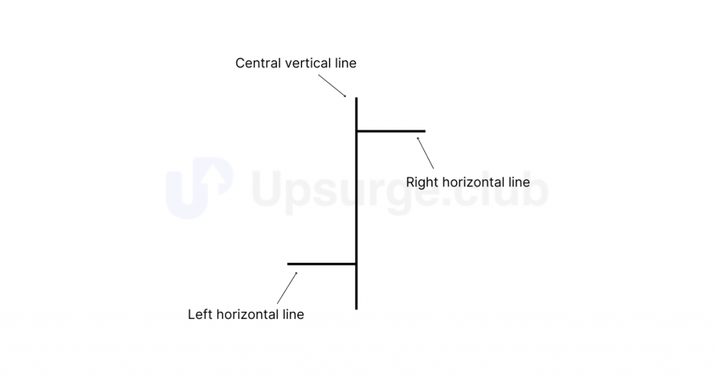
Here is a table summarizing what the different lines mean in a bar chart:
| Line | Meaning |
|---|---|
|
Central vertical line
|
The price range of the security during a specific period. The top of this line is the high price, and the bottom is the low price.
|
|
The left horizontal line |
Shows the price at which the security started trading in that period, i.e., opening price. |
|
The right horizontal line |
Shows the price at which the security traded at the end of that period, i.e., closing price. |
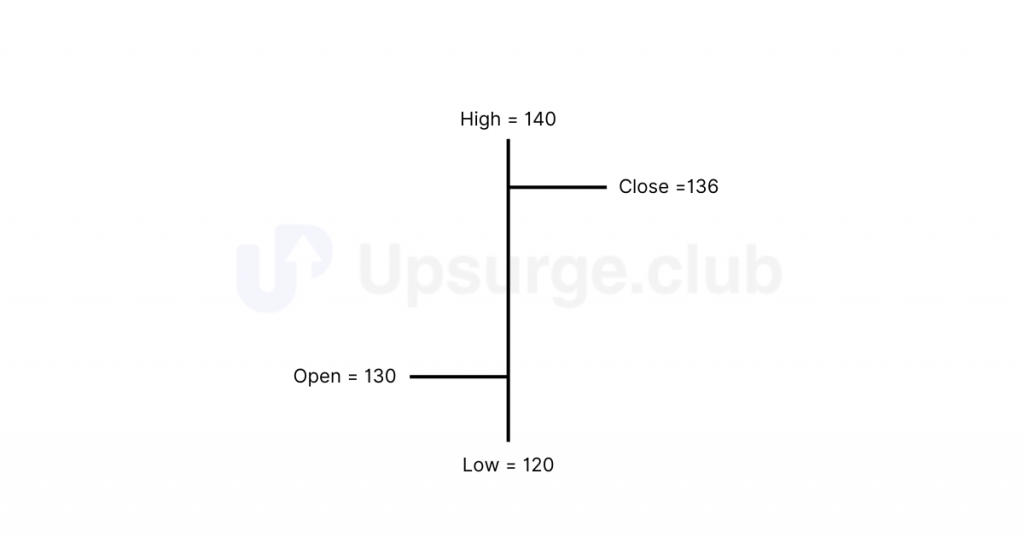
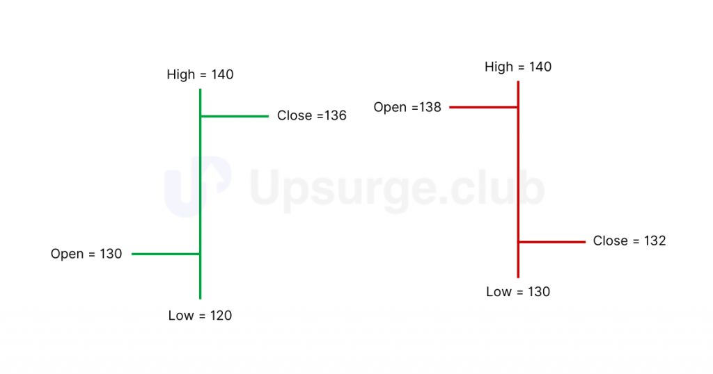
Let’s understand with an example. Assume OHLC (open, high, low, close) price data for a stock as follows:
Open – 130
High – 140
Low – 120
Close – 136
For the above data, the bar chart would look like this:
Here, you can see that we can plot all price types over a specific period in a single bar. Hence, if we create one bar for one day, we will have five vertical bars to view a five-day chart. Here is how a bar chart looks:
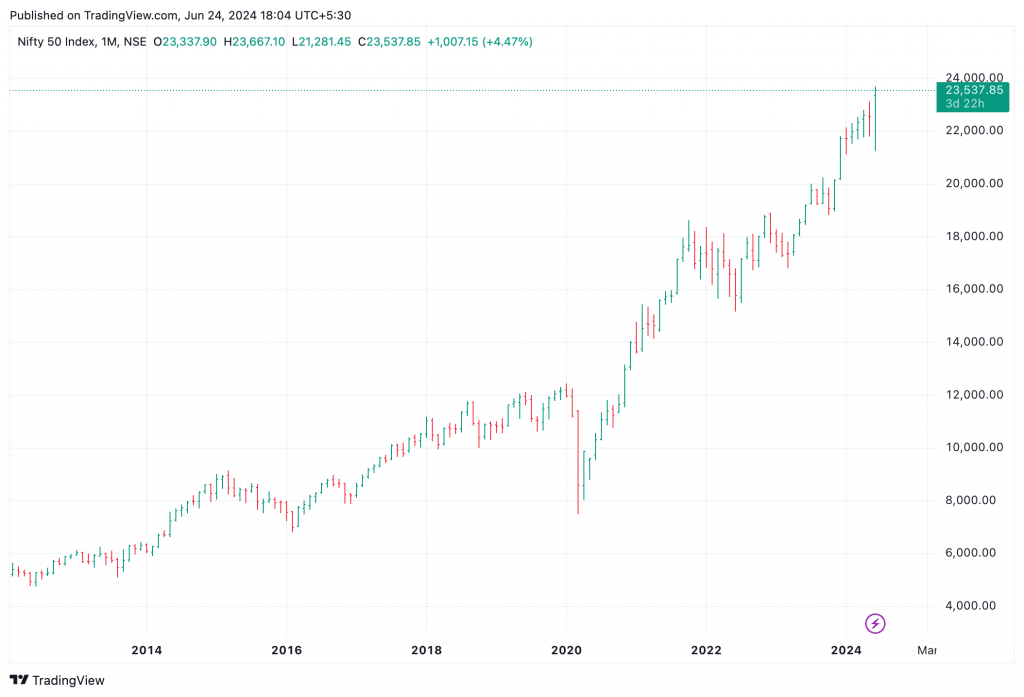
If the left horizontal line, which represents the opening price, is lower than the right horizontal line, i.e., the closing price, then it is a positive day for the markets, called a bullish day. A bullish day is typically represented by a green or blue bar.
If the left horizontal line, which represents the opening price, is higher than the right horizontal line, i.e., the closing price, then it is a negative day for the markets, called a bearish day. A bullish day is typically represented by a red or black bar.
Here is a snapshot of both types of bars:
The bar chart displays all four data points, but its disadvantage is that it lacks visual appeal. It is difficult and tedious to spot potential patterns when looking at a bar chart, especially the opening and closing prices. Analyzing bar charts in multiple time frames becomes more challenging.
Some traders prefer bar charts, so they are worth mentioning. However, most traders prefer Japanese candlesticks, the default option for most charting tools.
So, let’s dive deeper into them.
Lighting Up Your Trading Game with Candlesticks
In the 18th century, Homma discovered that by observing rice’s opening, closing, high, and low prices, he could identify patterns that predicted future price movements. This method allowed him to gain insights into market psychology and price action.
Although candlesticks have been used in Japan for centuries, western traders were unaware of them until the 1980s when Steve Nison introduced them in his book, “Japanese Candlestick Charting Techniques.” Following the book, many candlestick patterns retain their original Japanese names, adding an oriental touch to technical analysis.
Understanding a Candlestick
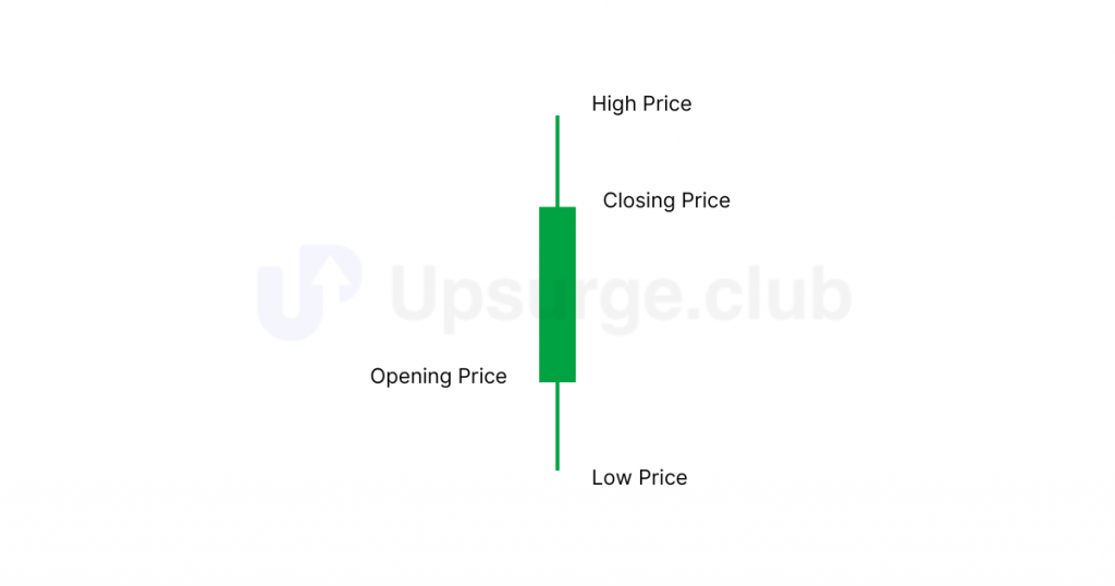
You have seen the bar chart, which shows opening and closing prices by a tick on the left and right of the bar, respectively. However, in a candlestick chart, the opening and closing prices are displayed by a rectangular body, and the high and low prices are displayed using wicks.
The candlestick, like a bar chart, is made of 3 components. Let’s look at how a bullish candlestick looks:
- The central body – The thicker, rectangular body connects the opening and closing price.
- Upper shadow – Connects the high price to the opening or closing price, whichever is greater.
- Lower Shadow – Connects the low price to the opening or closing price, whichever is lesser.
Here’s how a bullish candlestick looks:
Conversely, here’s how a bearish candlestick looks:
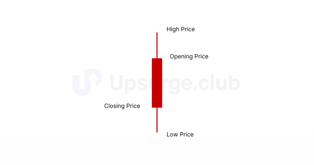
The candlestick chart takes shape by plotting them in a time series: green candles indicate bullishness, and red candles indicate bearishness.
In summary, candlesticks are easier to interpret than bar charts. They help you visualize the relationship between the opening and closing prices and the high and the low prices more clearly than any other chart type.
Interpreting Candlesticks
Candlesticks are super important because they help us predict market trends. They can show if prices will form trends that go up (bullish), down (bearish), or stay the same (sideways). Let’s check out each one!
- Bullish Trends (Uptrends): An uptrend is when prices rise. A bullish trend can be spotted when several candlesticks form consecutively higher, often with most candlesticks being green.
- Bearish Trends (Downtrends): A downtrend is when prices decline. A bearish trend can be spotted when you visit several candlesticks being formed consecutively lower, often with most candlesticks being red.
- Sideways Trends (Consolidation): A sideways trend is when prices remain within a small range over time in a narrow range, indicating little to no movement. This happens when multiple candles on a chart form at about the same level, neither going up nor down.
Now that you have understood candlesticks and their versatility, let’s examine other types of non-candlestick charts as well.
Some Other Useful Chart Types
While Japanese candlestick charts are widely used for their versatility, other charts like point and figure, Renko, and Heikin-Ashi charts are also crucial for analyzing trends. These charts offer unique perspectives that can enhance a trader’s understanding of market movements, helping to create a more comprehensive view of price action and trends.
Let’s learn a little about each one of them.
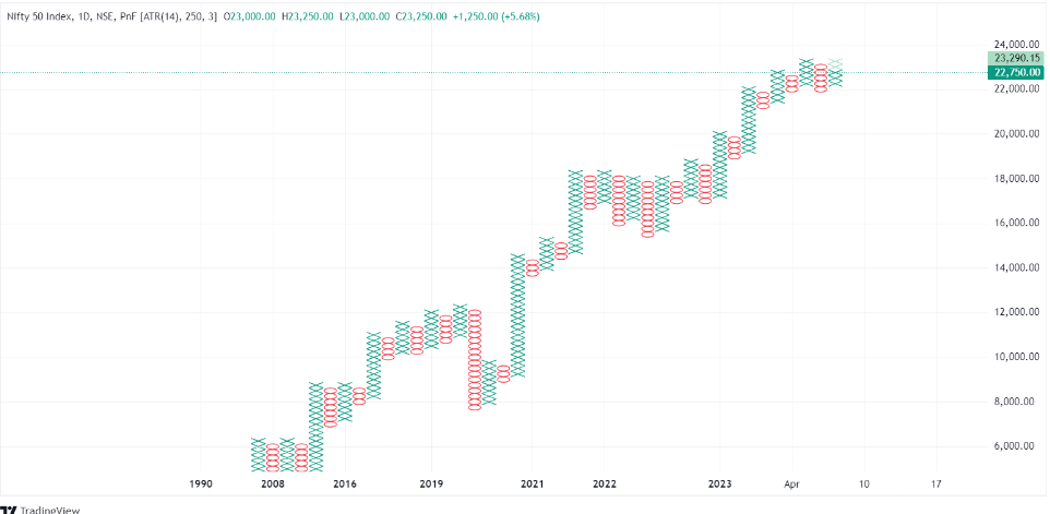
Point and figure charts focus solely on price movements, using Xs and Os to indicate rising and falling prices while ignoring time. This method filters out minor price fluctuations, making identifying major trends easier. However, the downside is that these charts can miss detailed price action since they do not consider the time factor.
As you have seen, you can use different charting types to your advantage, depending on your objective. However, Japanese candlesticks are widely used because of their versatility and simplicity. Here’s a table summarizing the pros and cons of each chart type:
| Chart Type | Pros | Cons |
|---|---|---|
|
Bar Chart |
Shows all price types (open, high, low, close), good for detailed analysis
|
Not very visually appealing, hard to spot patterns quickly |
|
Candlestick |
Easy to read and understand, shows market sentiment with color |
Can look cluttered, might give insufficient context
|
|
Point and Figure |
Filters out small price changes, highlights big trends
|
Ignores time, can miss detailed price movements
|
|
Renko |
Simplifies trends, reduces market noise |
Updates slowly, can miss short-term price changes
|
|
Heikin-Ashi |
Makes trends clearer, reduces small price fluctuations
|
Lags behind real-time changes, can hide immediate price signals
|
The leading reason traders prefer candlestick charts is that they are easily read and visually apparent. It shows crucial information in a simple format, making it easy to spot trends and patterns. Candlesticks reflect market sentiment with color, helping traders understand the market’s mood. Their versatility allows other tools to be used on top of them for a more comprehensive view and valuable analysis.
Trading Time Frames: Your Secret Weapon
When studying how stock prices move, a time frame is the duration of the candlestick you choose to examine. A candlestick can represent the trading activity of a day, week, month, year, or even minute. Choosing the right time frame is crucial in your trading game because it helps you understand different market trends.
The most common time frames used by technical analysts are:
- Monthly candlesticks
- Weekly candlesticks
- Daily or end-of-day candlesticks
- Intraday candlesticks like 30 minutes, 15 minutes, and 5 minutes
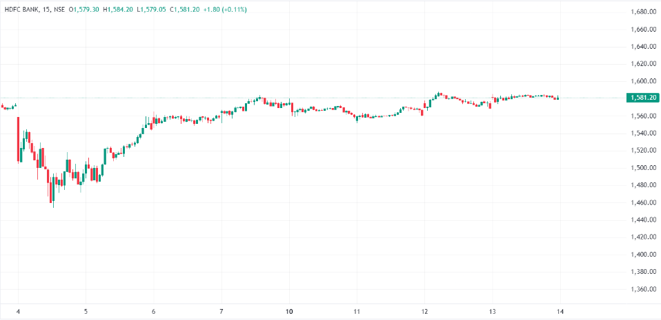
Look at the stock price of HDFC Bank and see how its chart differs in different time frames.
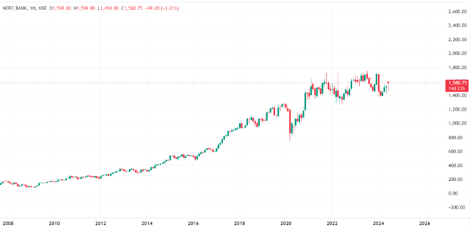
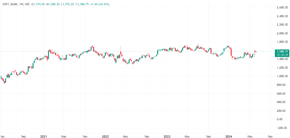
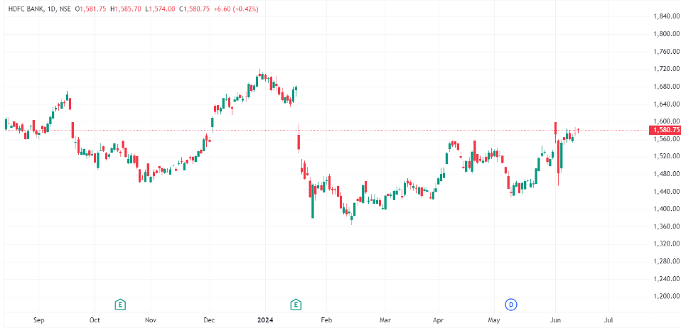
The monthly chart (2007-2024) shows HDFC Bank’s long-term trends over 17 years, as you see the four different time frames. The weekly chart (May 2020-June 2024) captures medium-term trends over four years. The number of candles increases when the time frame reduces.
Now, let’s uncover which time frame is suitable for you.
How to Pick Your Ideal Time Frame for Trading
Choose a time frame that fits your investment goals, market volatility, personal schedule, and trading time availability.
An individual must align the time frame with their trading style and goals. Intraday charts suit short-term traders aiming for quick gains, while long-term investors seeking sustained growth often rely on monthly or weekly charts.
Market volatility also plays a role. For instance, shorter time frames capture rapid price changes in high-volatility markets, while more extended time frames are better for stable markets. One should also consider the time they can give for trading because shorter time frames require more frequent monitoring, which may not be feasible for those with limited availability.
So, choose a trading time frame that matches your goals, market volatility, and availability. Here’s a table summarizing various time frames and when they should be used
| Time Frame | Useful When | Suitable For |
|---|---|---|
|
Monthly
|
Identifying long-term trends and major
market cycles |
Long-term investors |
|
Weekly |
Spotting medium to long-term trends |
Swing traders |
|
Daily |
Analyzing price movements over a period of a few days/weeks |
Swing traders and long-term investors |
|
Intraday |
Detailed views of price movements within a single trading day need to be seen |
Intraday traders |
Swing trader
Swing traders buy and sell stocks to profit from short-term price changes, usually holding them for a few days or weeks. We’ll learn more about swing trading in further chapters.
Traders also combine other time-frames to get a comprehensive of the market. Let’s look at that.
Blending Time Frames for Trading Success
You do not necessarily have to stick to one time frame. You can look at different time frames for trade objectives or even at multiple time frames to get a wider perspective of a stock price’s movement.
To identify the overall trend, you can look at longer time frames, such as daily or weekly. Then, you can switch to shorter time frames, such as hourly or 15-minute charts, to identify entry and exit points in the market. Generally, this method is helpful to avoid false signals and confirm trends. Here’s how it can work.
Let’s get an idea of how this works.
A trader notices HDFC Bank’s stock rising on the daily chart, moving from ₹1,400 to ₹1,450 over the past week. This shows a strong upward trend. The trader switches to a 15-minute chart to find a good buying point.
The 15-minute chart shows that HDFC Bank opened at ₹1,455 but then dipped to ₹1,450. This dip can be seen as the stock price briefly returning to its average level before continuing to rise, a concept known as mean reversion.
Seeing this brief dip within the overall uptrend, the trader buys shares at ₹1,450. They increase their chances of success by aligning their short-term trade with the long-term trend and considering the mean reversion.
Using multiple timeframes and the idea of mean reversion, the trader makes a well-rounded decision, reducing the risk of false signals and improving the likelihood of a successful trade.
Summary
- The different types of prices in a defined period – Open, High, Low, Close
- Open Price: The first price at which a stock is traded when the market opens for the day.
- High Price: The highest price at which a stock is traded during a specific period, like a day.
- Low Price: The lowest price at which a stock is traded during a particular period, like a day.
- Close Price: The final price at which a stock is traded, serving as a reference point for the next day.
- Different chart types used in technical analysis include:
- Line Charts: Simple and easy to understand, using only closing prices.
- Bar Charts: Show all price types (open, high, low, close) without visual appeal.
- Candlestick Charts: Preferred by traders for their visual clarity and ability to show market sentiment.
- Japanese candlestick charts are highly favored for their versatility, ease of interpretation, and ability to highlight trends and market sentiment effectively.
- Other Chart Types and Their Characteristics:
- Point and Figure Charts: Focus on price movements and ignore time, making them suitable for spotting major trends but lacking detailed price action.
- Renko Charts: Renko charts use bricks to simplify trends. They effectively highlight trends but can be slow to update as they only form a new brick when the price moves by a specific amount.
- Heikin-Ashi Charts: Heikin-Ashi charts smooth out price data, making trends more apparent. The average price data reduces market noise, but this smoothing causes a lag in real-time changes.
- Select a timeframe that aligns with your investment goals, matches the market’s volatility, and fits into your personal schedule for effective trading.
- Combining longer timeframes (daily or weekly) with shorter ones (hourly or 15-minute) helps identify overall trends and find precise entry/exit points, reducing the risk of false signals.