Chapter 4: MACD Scalping Strategy
Overview
To find a good trade, we need two things: first, to see the market trend, whether it’s going up (bullish) or down (bearish), and second, to know the best time to enter after we understand the trend. This MACD scalping strategy helps with both. We only use one indicator, the Moving Average Convergence Divergence (MACD), and combine it with divergence to find the right points to enter and exit the market.
We’ll review the concept of divergence since it’s the core of this strategy. The MACD scalping strategy works best for indexes with high liquidity, like Nifty50, Bank Nifty, and Fin Nifty. These liquid indexes are ideal since we scalp on a 1-minute time frame. We also use double bottom and double top patterns to help identify entry and exit signals. This strategy includes predefined stop-loss and target points, as we’re trading in such a short time frame.
MACD and divergence
In this scalping strategy, we’ll use the MACD technical indicator to determine entry points after identifying the trend. Traders often use MACD, a momentum oscillator indicator, to trade based on trends.
The MACD has three main components: the MACD line, the signal line, and the histogram. Here’s how each one is calculated:
MACD Line=Shorter-period EMA−Longer-period EMA
Signal Line=EMA of the MACD Line over a chosen period.
Histogram=MACD Line−Signal Line
Check out an in-depth explanation of MACD here.
Divergence
Divergence happens when the price moves in one direction while an oscillator (like MACD or any other) moves in the opposite direction. Divergence is a powerful concept because it can signal where the market might reverse direction, helping traders identify potential entry and exit points more accurately.
Divergence is mainly categorized into three types: strong, medium, and hidden divergence. To identify divergence on a stock or index we are trading, we start by spotting higher highs or lower lows in the price and then compare these with the indicator. Based on the divergence type, we decide on our trade. Here’s a look at the three types of divergence:
Strong Divergence
This occurs when we find a clear and sharp contrast between the price of a stock or index and a technical indicator like RSI or MACD.
For example, in the chart below of Nifty50, the price clearly forms a lower low, but the technical indicator forms a higher high. This means the index has lost momentum in the bearish direction and may now reverse.
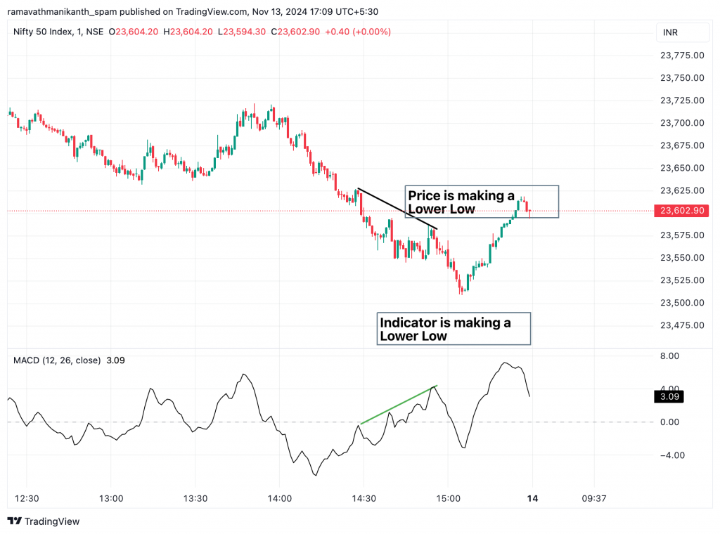
Just after that, the Nifty went up, indicating solid divergence in the market.
Medium Divergence
We find this type of indicator when both the price of the stock/index and the technical indicator show diverging effects. This indicates a shift in momentum rather than a clear reversal signal, meaning this type of divergence has a lower probability of causing a market reversal.
Here is an example of it on the Bank Nifty chart:
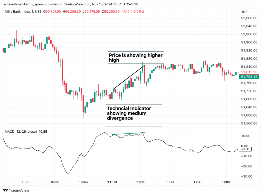
Medium divergence is more commonly found in sideways and choppy markets. In the image above, we can see that although divergence occurred, the market went sideways afterward. Therefore, it’s often better to take trades based on this type of divergence in such market conditions.
Hidden Divergence
This is the final type of divergence. We see this when both the technical indicator, like MACD or RSI, and the price of the stock/index form the same pattern, such as both making higher highs or lower lows. This indicates that momentum is still present in the ongoing direction, whether bullish or bearish.
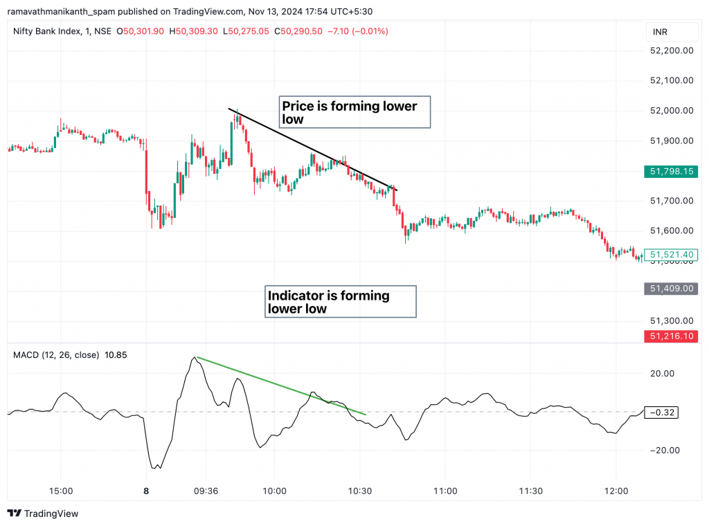
In the image above, we can see both the indicator and the price forming lower lows, and afterward, Bank Nifty continued to decline. This is a sign of hidden divergence, indicating that we should take trades based on the trending market.
How to spot a divergence
Divergence helps us identify trend reversals, but some of us may find it challenging to spot divergence between the price of a stock/index and a technical indicator. To make this easier, we can switch to a line chart for both the price and the indicator. This way, we can more easily identify divergence in the stock.
We can see how it will look if we switch to a line chart. As we can see in the image, it is easy to find the divergence when we switch to a line chart.
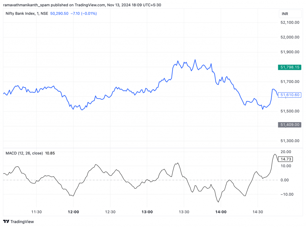
Here is a step-by-step approach to finding divergence:
- Check the line chart for recent highs and lows in both the price and the indicator.
- If there’s a clear difference, like a higher low in price and a lower low in the indicator, it’s a strong divergence. This often signals a possible trend reversal.
- If the difference is small, it’s a medium divergence. This usually means a slowdown, not a full reversal.
- If the price trend is up but the indicator shows a downtrend (or vice versa), it’s hidden divergence. This suggests the current trend may continue.
Spotting an entry
The MACD strategy uses a single technical indicator, but changing visibility settings can improve its components. In the updated setup, the MACD line is displayed as a step line instead of a histogram, and the signal and EMA lines are kept in the same colour. This makes it easier to read trends and spot entry or exit points.
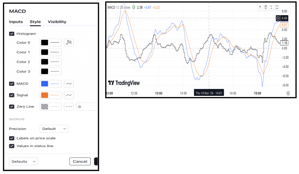
We have changed the regular histogram to stepped lines, making spotting divergences and identifying entry signals easier. Now, let’s focus on recognizing bullish and bearish entry points. Since we’re trading indices, we’ll use options to take positions, buying calls or puts based on our market anticipation.
Bullish Entry
This strategy focuses on spotting reversals, so we must watch for opposing trends to uncover trading opportunities. In this case, we look for a downtrend to identify bottoms and observe the type of divergence forming. It becomes easier to pinpoint these bottoms when we hide the MACD and signal lines, focusing solely on the histogram. Here are the specific conditions to follow for this approach.
- Mark two consecutive lower lows in a downtrend as potential reversal points.
- Observe for strong divergence in the MACD indicator, indicating a trend shift.
- Enter the trade when the MACD line crosses above the signal line, confirming the momentum.
When we find a substantial divergence combined with a MACD crossover, it strongly indicates a change in trend direction. For example, this setup can signal a potential bullish reversal in a downtrend. Below is a chart illustrating this in a strong downtrend.
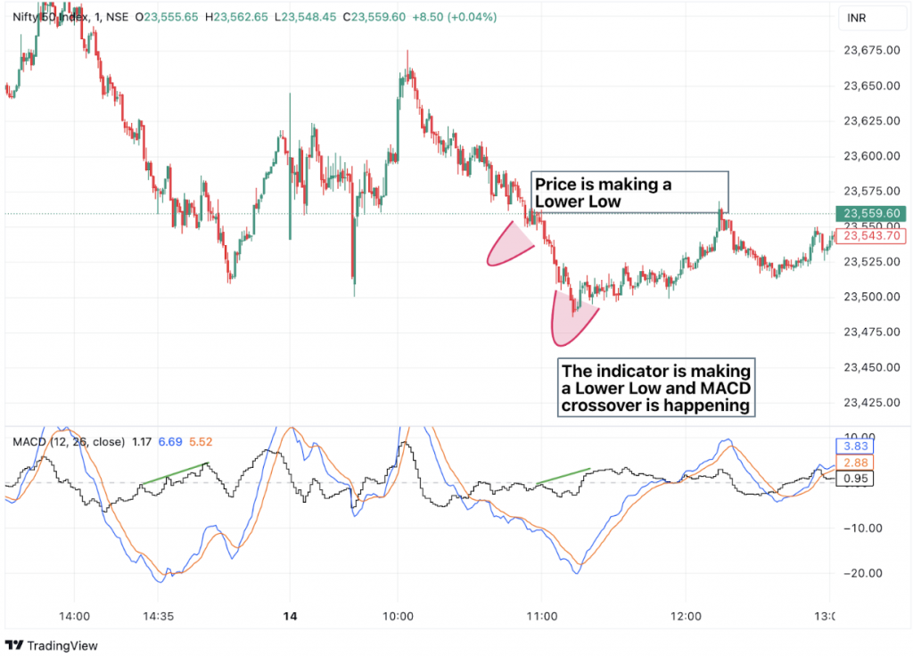
For the bearish entry, we need to short the index here are its conditions.
- Mark two consecutive lower lows in a downtrend as potential reversal points.
- Observe for strong divergence in the MACD indicator, indicating a trend shift.
- Enter the trade when the MACD line crosses above the signal line, confirming the momentum.
Bearish Entry
Here’s a simple example to help clarify. In the image below, we see that after a strong divergence in the technical indicator, the uptrend in price reverses direction.
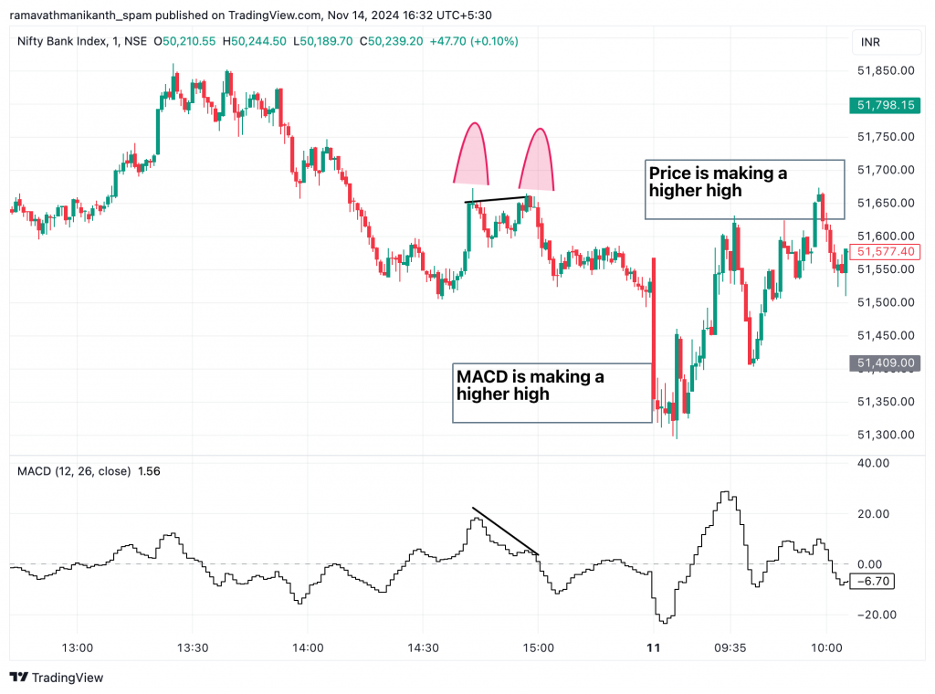
We will enter at the high of the specific candle, applying this approach for both bullish and bearish trades. Since we’re trading highly liquid indices like Nifty and Bank Nifty, we’ll buy At-The-Money call or put options at entry. With predefined targets and a close stop loss, we can manage risk effectively without worrying about the impact of delta or theta (options Greeks).
Now, we will move on to the exit part of this MACD strategy.
Planning a exit
In this MACD divergence strategy, there are two exit options. One approach is to set a predefined target, aiming for a specific number of points based on the chosen time frame. The other option is to exit based on the MACD indicator, similar to the entry, by watching for a crossover in the opposite direction. This ensures flexibility in capturing profits or adjusting to market conditions.
Pre-defined target
We are trading on a 1-minute time frame using the MACD divergence strategy, with a 50-point target as our exit signal for both directions. For example, if we enter a trade when the Nifty50 index is at 23,523, our target will be 23,473. Since the 1-minute time frame is highly volatile, a moderate target of 50 points suits this strategy well.
Setting a predefined target adds structure to our trades, promotes disciplined trading, reduces emotional influence, and supports effective risk management. Ultimately, this approach helps improve consistency and sustainability, which is essential for scalping.
MACD exit
This type of exit is more suitable for slightly higher time frames because MACD crossovers take longer to develop, providing more apparent and more reliable signals. However, price movements are more volatile on shorter time frames like 1-minute charts, often causing frequent MACD crossovers that can lead to premature exits.
Let’s look at the pre-defined type of exits for the MACD divergence strategy.
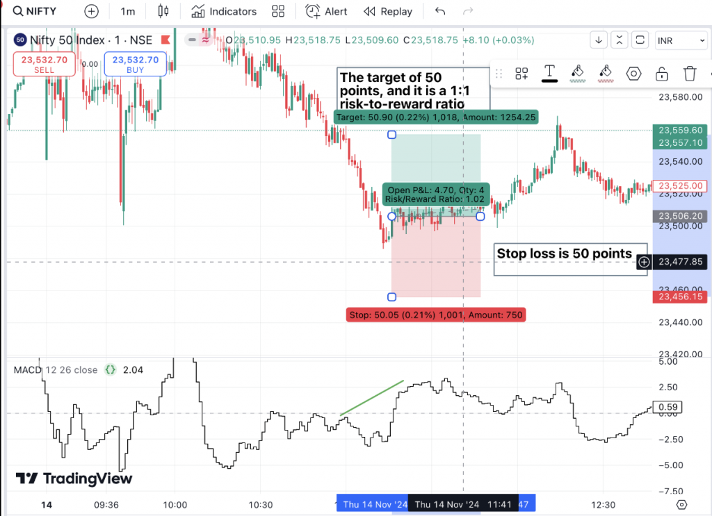
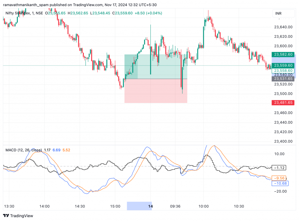
The image above shows that the target is set using the first exit method (predefined target) and is nearly achieved within a short time frame of just one hour. This demonstrates the effectiveness of a 1:1 risk-to-reward ratio in a volatile 1-minute chart setting.
Stop loss
In the MACD divergence strategy, we can set up stop loss based on the risk-to-reward ratio of 1:1, where we enter the crossover signal at the high of the candle at the 1-minute time frame we keep the stop loss as of 50 points in the index/stocks.
We can set the stop loss using the crossover of the MACD indicator. This way, we follow the indicator’s signals and stay in the trade as long as the trend continues. However, this approach is riskier because MACD signals can be delayed, which might cause bigger losses if the price moves sharply before the crossover. It can also lead to early exits in choppy or unstable markets, making it harder for us to capture the full profit from a trend.
Example
We will explore additional examples using Nifty-50 and Bank Nifty to gain a deeper understanding of this strategy. We will apply the same approach as before, using a one-minute time frame and the MACD technical indicator.
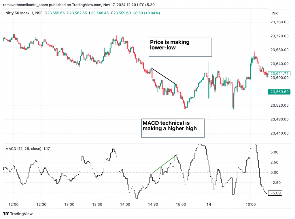
In the above chart of Nifty-50, the technical indicator shows a higher high, while the price forms a lower low. This indicates a strong divergence, suggesting a potential reversal. Following this divergence, the Nifty-50 has changed its direction, signalling strong bullishness. In this scenario, we will plan a long trade. We will wait for a crossover signal from the MACD technical indicator to confirm the bullish momentum for the entry point.
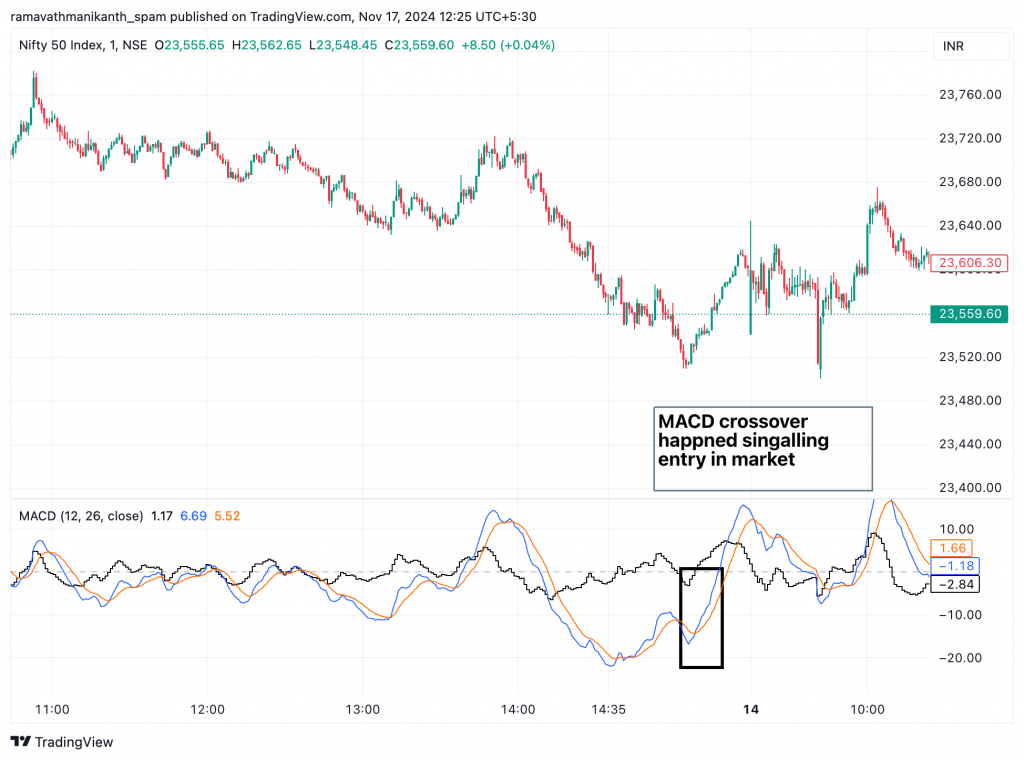
Here’s how the long trade is structured: we set a 50-point stop loss and a 50-point target. The target was achieved within 23 minutes, making it an efficient way to accumulate profits. In this scenario, we would have purchased the at-the-money (ATM) option in Nifty-50 and sold it after reaching the target, locking in the gains effectively. The pictorial representation is below.
Things to remember
To understand what makes such setups effective, focusing on a few fundamental principles is essential. These include the importance of maintaining a disciplined approach; here are some critical things to remember:
- In this MACD divergence strategy, we have used the MACD indicator as an oscillator to identify trends and spot divergences. Other oscillators, such as RSI or Stochastic RSI, can also be used similarly.
- If we want to apply this strategy to stocks, it is crucial to focus on high-liquidity stocks.
- When making an entry, we should monitor volume closely. A higher volume, combined with textbook candlestick patterns like Marubozu or Morning Star, increases the chances of success.
- If we are risk-averse traders, we should stick to this disciplined trading style and prioritize high-probability setups.